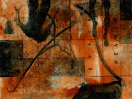
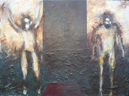
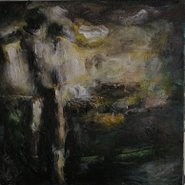
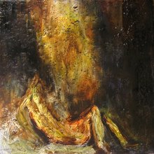
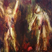
"From Rise onwards I realised that it was very important not to have a direct opposition. If there were, the colour energy would be locked up in the complimentary contrast, as though in straight jacket. It is released by instability, a freely floating flux. Each colour has to be balanced so that the slightest influence from a neighbouring colour will throw it off that very balance -and this is true for all of them in turn, whether there are three or five colours, so that they continually shift this way and that. But there also has to be an overall colour-bias which governs the entire canvas. Otherwise the sheer amount of coloured light released will lead to iridescence, light energy running right around the spectrum."
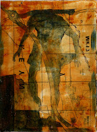
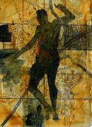
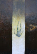
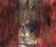
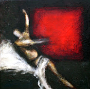
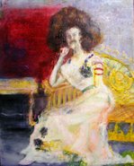
I believe that this can be compared in some way to Toms attempts at taking one colour then moving it to its various tonal ends. They are both ways of ascending to some sort of order through limitation, Rileys is perhaps the more rounded, and allows more variation within it. The question is, can we take this theory and apply it to figurative art, the answer is most certainly yes as Bridget Riley took this idea out of her observations of earlier artists; Titian, Veronese, El Greco, Rubens, Poussin and the like. However, perhaps the most important factor for us to take into account is how do we move this theory back into the figurative without simply and blindly moving back into the same environment as the previously mentioned artists. When constructing a painting that, for want of a better description, takes a 'realist' stance, it is extremely difficult to simplify the chromatic field down to the level that riley's abstract vibrations can go. There are certain conventions that we are going to have to accept, we are going to have fore-go the 'all-overness' that you experience in a riley, and as such the dynamic qualtities harnessed by pockets and diagonals of chromatic harmony can be released, these rhythms are where the strength of figurative painting is generated. If we utilize rileys balancing techniques within these rhythms then it seems all we will be succeeding in doing is developing a style akin to Veronese, where a grey that lies on the side of warm or cool is used as a backdrop to 'bed-in' the tapestry of bolder colours and hues which provide the dynamic diagonals. Is it possible to disintegrate the unifying grey into pockets of varying heats and hues that act as a disruptor, whilst being subtle enough to not break apart the image completely? I've probably tried this before and failed. oh well.
Subscribe to:
Post Comments (Atom)


No comments:
Post a Comment